 MOBILE APP TESTING
 Responsive Testing: A Comprehensive Guide to Ensuring Cross-Device Compatibility and Optimal User Experience


In 2023, mobile devices accounted for 62.06% of global website traffic, underscoring the necessity for seamless cross-device compatibility. A website’s failure to adapt to varying screen sizes and orientations can lead to diminished user engagement, reduced conversion rates, and adverse impacts on search engine rankings. Google’s mobile-first indexing prioritizes mobile-friendly websites, making responsive testing an indispensable component of both user experience (UX) design and search engine optimization (SEO).
This guide provides a systematic approach to responsive testing, combining technical methodologies, industry best practices, and actionable insights to ensure your website meets contemporary standards for performance and accessibility.
Section 1: Understanding Responsive Testing
Responsive testing refers to the rigorous evaluation of a website’s ability to adjust its layout, content, and functionality across diverse devices, screen resolutions, and browsers. It validates the implementation of responsive design principles, ensuring consistency in user interactions regardless of hardware or software variations.
1.1 Distinguishing Responsive Design from Responsive Testing
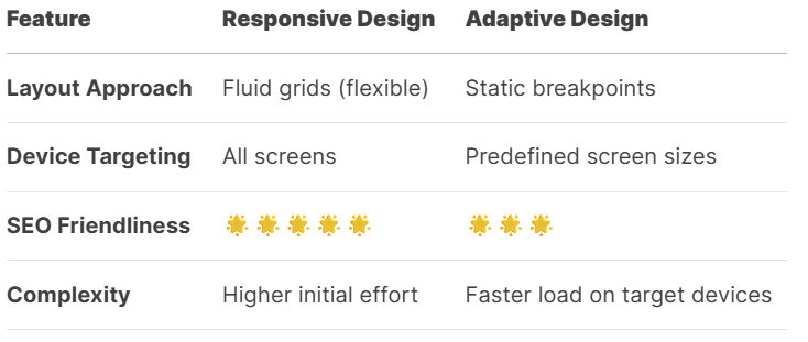
- Responsive Design: The development of flexible layouts using fluid grids, scalable media, and CSS media queries.
- Responsive Testing: The empirical validation of these designs through cross-device and cross-browser compatibility checks.
1.2 Core Components of Responsive Testing
- Fluid Grid Systems: Ensuring proportional scaling of layout elements.
- Adaptive Media: Verifying images and videos resize without distortion.
- Breakpoint Validation: Testing layout adjustments at standard screen widths (e.g., 320px, 768px, 1024px).
- Cross-Browser Compatibility: Confirming consistent rendering across Chrome, Safari, Firefox, and Edge.
Table 1: Responsive Design vs. Adaptive Design
Section 2: The Strategic Importance of Responsive Testing
2.1 Enhancing User Experience
Inconsistent rendering across devices leads to navigational challenges, unreadable content, and functional errors. For instance, a poorly optimized mobile menu may reduce conversion rates by up to 40%. Post-optimization, businesses often observe improvements of 25–30% in mobile engagement metrics.
2.2 SEO and Mobile-First Indexing
Google’s mobile-first indexing mandates that non-responsive websites face ranking penalties. Research indicates that mobile-unfriendly sites experience:
- A 53% increase in bounce rates.
- A decline of 3+ positions in search engine results pages (SERPs).
2.3 Cost Efficiency and Scalability
Maintaining separate desktop and mobile versions of a website incurs 2.7 times the development and maintenance costs. A single responsive site reduces overhead while accommodating emerging devices, such as foldable smartphones and tablets.
Section 3: Methodologies for Effective Responsive Testing
3.1 Step 1: Device and Browser Prioritization
Leverage analytics tools (e.g., Google Analytics) to identify the most frequently used devices and browsers among your audience. Prioritize testing on:
- High-traffic devices (e.g., iPhone 15, Samsung Galaxy S23).
- Legacy devices with significant market share.
- Multiple browsers (Chrome, Safari, Firefox).
3.2 Step 2: Emulation vs. Physical Device Testing
- Emulators: Efficient for initial layout validation (e.g., Chrome DevTools, BrowserStack).
- Physical Devices: Essential for evaluating touch responsiveness, battery consumption, and hardware-specific bugs.
3.3 Step 3: Breakpoint and Layout Testing
Validate responsiveness at critical breakpoints:
- 320px (Mobile portrait).
- 768px (Tablet portrait).
- 1024px (Tablet landscape).
- 1200px+ (Desktop).
Checklist for Breakpoint Validation:
- Text elements do not overflow containers.
- Images scale proportionally.
- Interactive elements (e.g., buttons) remain accessible.
3.4 Step 4: Cross-Browser Compatibility Testing
Common issues include inconsistent CSS rendering and JavaScript errors. Solutions include:
- Using vendor prefixes (-webkit-, -moz-).
- Testing on cloud platforms like LambdaTest.
3.5 Step 5: Performance Optimization
Mobile users expect load times under three seconds. Tools such as Google Lighthouse and GTmetrix help identify bottlenecks, including:
- Unoptimized images (solution: WebP format).
- Render-blocking JavaScript.
3.6 Step 6: Touch and Gesture Validation
Ensure compatibility with standard gestures (e.g., pinch-to-zoom, swipe navigation) and avoid hover-dependent interactions.
Section 4: Best Practices for Sustainable Responsive Testing
- Adopt a Mobile-First Development Strategy: Begin with mobile layouts to prioritize constrained screens.
- Integrate Testing into CI/CD Pipelines: Automate regression testing via Selenium or Cypress.
- Optimize Media Assets: Implement lazy loading and responsive image syntax (srcset).
- Test Under Real-World Conditions: Simulate 3G networks and low-end devices.
- Validate Content Hierarchy: Ensure critical information remains visible on smaller screens.
Section 5: Addressing Common Challenges
- Device Fragmentation: Utilize cloud testing platforms (e.g., BrowserStack) to access 3,000+ device-browser combinations.
- Browser-Specific Bugs: Regularly update browser compatibility matrices.
- Performance Degradation: Compress assets and leverage content delivery networks (CDNs).
Frequently Asked Questions (FAQ)
Q1: What distinguishes responsive design from adaptive design?
A: Responsive design employs fluid grids for continuous scaling, while adaptive design uses static layouts tailored to specific breakpoints.
Q2: How frequently should responsive testing be conducted?
A: After every major update and quarterly to accommodate new devices and browser updates.
Q3: Are WordPress themes inherently responsive?
A: While many claim responsiveness, third-party plugins and customizations often introduce compatibility issues. Manual validation is advised.
Q4: Does responsive testing influence SEO performance?
A: Directly. Non-responsive sites are penalized in mobile-first indexing, reducing search visibility.
Q5: What is the most frequent oversight in responsive testing?
A: Neglecting to test foldable devices and landscape orientations.
Conclusion: Implementing a Proactive Responsive Testing Strategy
Responsive testing is a non-negotiable practice for modern web development. Organizations that prioritize cross-device compatibility observe measurable improvements in user retention, conversion rates, and search rankings.
Recommended Actions:
- Conduct an audit using Google’s Mobile-Friendly Test.
- Establish a device prioritization matrix based on analytics.
- Integrate automated testing tools into development workflows.